
If you have ever looked at a stock chart and felt confused by all those lines and waves, you are not alone. Most people think technical analysis is only for traders or experts. In reality, it is simply a way to read the story of price movement — where the stock has struggled, where it found support, and how emotions of fear and confidence show up on the chart.
In this article, we will look at Tata Consultancy Services Ltd. TCS (NSE) using the last five years of daily price data (Feb 2021 to Feb 2026) and try to understand the stock in a very human way.
This is purely for educational purposes, not investment advice.
The Big Picture: What Has TCS Been Doing?
When we plot the TCS price over the last five years, we clearly see three phases:
- A strong uptrend in the early part
- A long sideways and distribution phase
- A gradual downtrend and recovery attempts
This is a classic life cycle of many large-cap stocks.
To understand this better, let us start with the moving averages.
The Trend: 50-Day & 200-Day Moving Averages
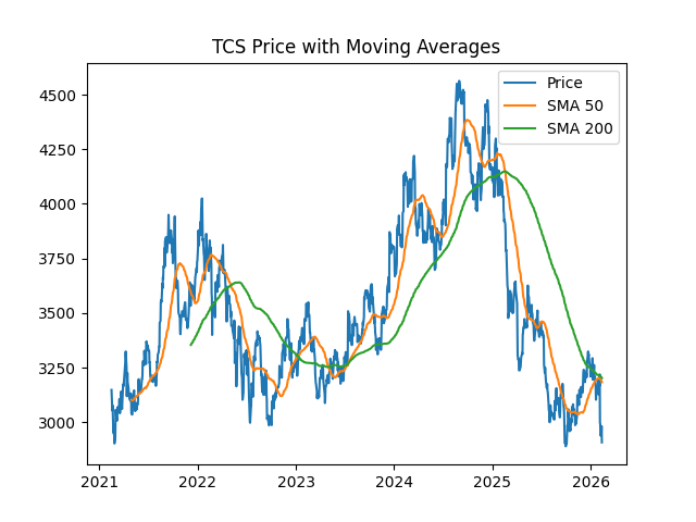
Chart: Simple Moving Average (Price with moving averages)
This chart shows:
- The black line → actual TCS price
- The short smooth line → 50-day average (short-term mood)
- The long smooth line → 200-day average (long-term mood)
What this means
Think of moving averages like the stock’s “memory.”
- When the price stays above both lines, the stock is confident and bullish.
- When the price falls below both lines, it signals weakness.
In your chart, notice how:
- TCS stayed above the 200-day line during its strong phase.
- Later, the price repeatedly fell below the 200-day average.
- Each time it tried to rise, the 200-day line acted like a ceiling — this is known as dynamic resistance.
This tells us that the long-term trend weakened, and buyers were not strong enough to push the stock into a fresh rally.
The Energy Level: RSI
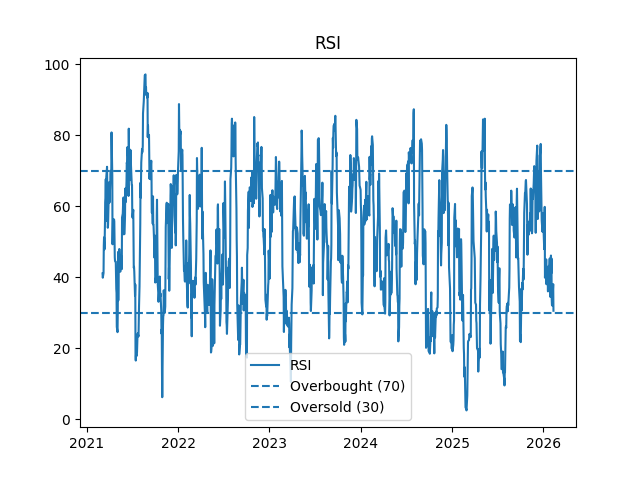
Chart: Relative Strength Index
RSI is like a speedometer for the stock’s strength.
- Above 70 → too fast (overbought)
- Below 30 → too slow (oversold)
TCS often struggled to cross 60–65.
- It touched the 30–35 zone multiple times.
This tells us that selling pressure was stronger than buying pressure for long periods. Every rally was short-lived, showing hesitation among buyers.
The Trend Engine: MACD
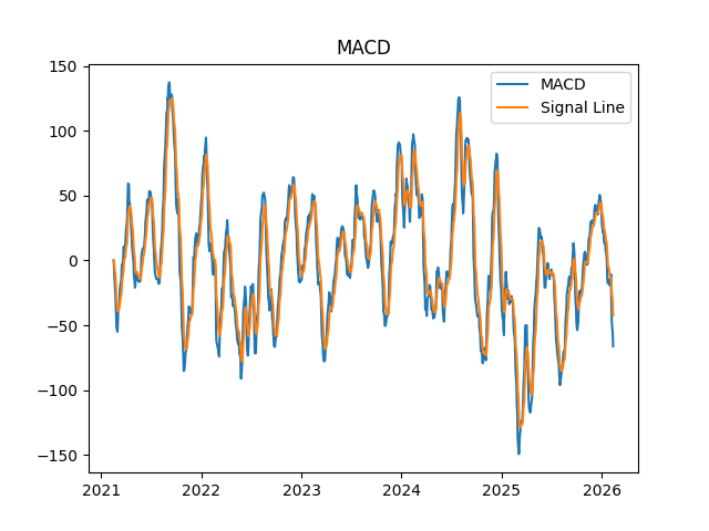
Chart: Moving Average Convergence Divergence
MACD shows whether the stock has momentum.
- When MACD is above the signal line → bullish push
- When below → bearish pressure
In the TCS chart, we see:
- Repeated bearish crossovers
- Short bullish phases that quickly faded
This confirms that the stock has been in a weak momentum cycle, even when price tried to recover.
Pattern Psychology: What Repeatedly Happens
From the price structure, we see a repeating behavior:
- Every time the stock rises near a previous high, selling starts again
- When it falls into a lower zone, buyers step in, but not strongly
This forms a range-bound structure, which is a sign of indecision and accumulation.
Such zones often appear before a big directional move, either up or down, once emotions shift.
What This Means for a Normal Investor
In very simple words:
- The long-term confidence in TCS weakened after its peak.
- Buyers are present, but not aggressive.
- Sellers are still active near higher price zones.
- Momentum indicators (RSI & MACD) show caution, not strength.
This is not a “fast rally” type stock right now. It is behaving like a stock that is waiting for a new story or trigger.
Final Thought
Charts do not predict the future — they show human behavior frozen in time.
TCS’s chart is telling us that the market is still deciding its next big direction.
For learning, this stock is a beautiful example of:
- How trends weaken
- How averages act as resistance
- How momentum fades before a big move
Leave a Reply